Get2down — Brand Guidelines (Tech g7)
A concise visual system for software product sites: logo, color palette, typography, components and imagery rules tuned for SaaS and desktop software experiences.
- Primary use: product landing pages, marketing microsites, product docs
- Tone: confident, technical, human-centered
- Target: B2B buyers, product teams, developers
Color palette
Primary and semantic colors for UI, marketing and illustrations. Use exact hex values in CSS variables.
Usage rules
- Primary color for CTAs and highlights; use with dark ink text when on light backgrounds.
- Ink colors for headings and body text; ensure 4.5:1 contrast for body copy.
- Use accent sparingly for micro-interactions and links.
Typography
Modern, legible fonts for UI and documentation. Variable fonts preferred; fallbacks listed below.
Headings
Product Title — 48px / 3rem
Section Title — 28px / 1.75rem
Stack: Inter var (600) → system-sans
Body & UI
Body — 16px / 1rem (Inter var 400)
UI labels — 14px / 0.875rem (600 for emphasis)
Monospace — for code snippets: JetBrains Mono, monospace
Font stack (CSS)
:root{
  --font-sans: "Inter", system-ui, -apple-system, "Segoe UI", Roboto, "Helvetica Neue", Arial;
  --font-mono: "JetBrains Mono", ui-monospace, SFMono-Regular, monospace;
}
Logo & clearspace
Primary mark
Use the horizontal lockup on light and dark backgrounds. Maintain clearspace equal to the height of the "G" around the mark.

Components & patterns
Reusable building blocks for product UI — buttons, cards, form controls, and notifications.
Patterns — FAQ
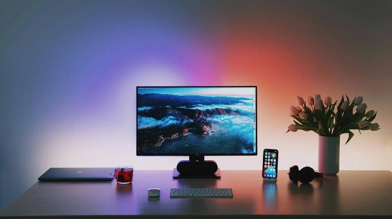
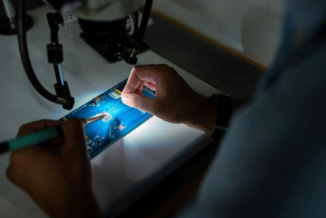
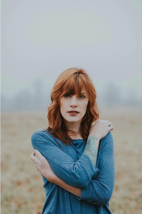
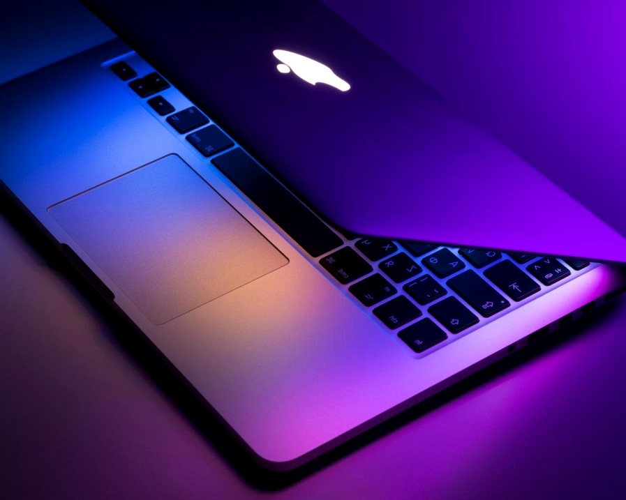
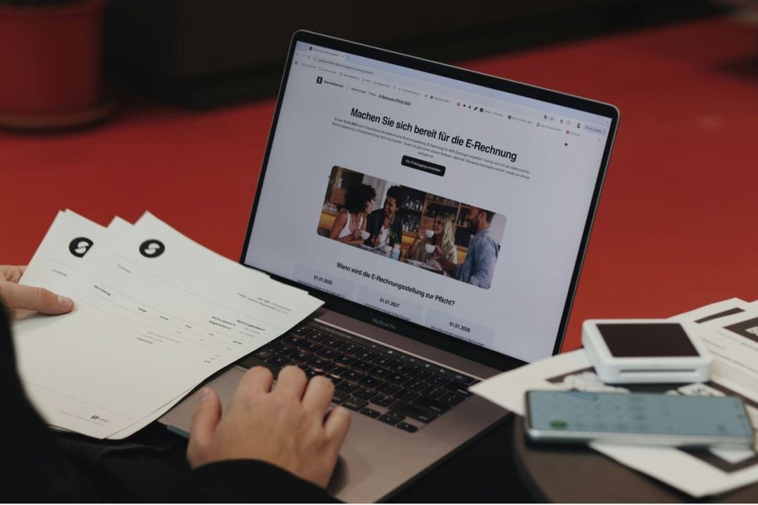
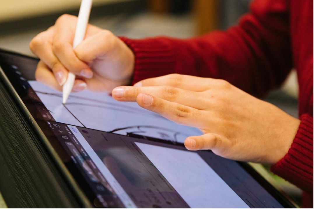
Imagery & photography
Photography style: close-up of device screens, real teams, workspace details. Prefer warm highlights on dark backgrounds.
Do / Don't
- Do use contextual screenshots with device mockups.
- Don't use low-resolution, oversaturated or heavily filtered stock images.
Accessibility, licensing & next steps
We prioritize accessible contrast, keyboard focus states, and semantic markup. Brand assets are governed by our usage license included in the kit.
| Topic | Notes |
|---|---|
| Contrast | All text >= 4.5:1 for body; AA minimum for UI |
| Alt text | Descriptive alt required for informative images |
| Licensing | Brand kit includes permitted uses and redistribution rules |